Catalogue Designing & Printing: Best Practice Secrets

Catalogue Designing & Printing Best Practice Secrets

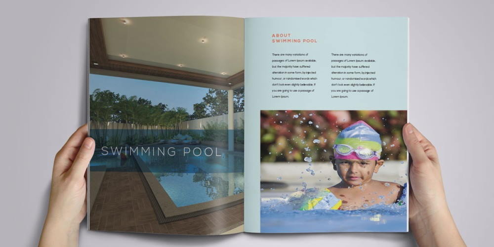
Printed catalogues and directories have a long shelf life so they remain popular for companies who sell a large range of products. Consumer catalogues are still widely used for fashion, homeware, consumer electronics and gardens, while business-to-business catalogues are often used for components, machines, tools and other industrial products.

Keeping in mind the costs of designing, production, printing and postage, it’s important to get catalogue printing right first time. What are the secrets to a successful catalogue marketing? It starts with design and production.

Start by thinking about size and aspects. Common, economical sizes which are typically used for catalogue printing are B5 (240 x 170mm) A5 (210 x 148mm) or A4 (297 x 210mm). Do you want portrait or landscape? This might depend on your images, especially the size and quality, but it’s very much a personal preference. The widescreen look, A4 landscape, is a popular modern style. Calico can advise you on what’s best for your products.

Colour.

Most catalogues and directories are printed in 4 colours throughout, although sometimes a fifth colour, typically a Pantone (PMS), might be specified for a specific element, like a logo, to ensure colour consistency throughout. Calico has many clients who use metallic inks such as gold or silver for beautiful effects, especially on covers.

Branding and brand identity.

Catalogues are highly effective marketing tools for your brand. Newer brands may need to shout louder than established big players, so it’s important to prioritise your brand name and graphic identity. Strong brands typically use their name or trademarks for their catalogue name. Emerging brands must use a compelling catalogue name, but might also want to describe their products on the cover.

Read more

Five steps to great logo design

Five steps to great logo design

It can be difficult to take the plunge, a shake-up and change from the familiar branding you see day-in, day-out. But if you’re a business owner, a budding entrepreneur or just been tasked with overseeing the project; we all have to go through a re-brand at some point – starting with a logo design. This short five step guide is here to help you not be too overwhelmed by this sometimes daunting task.

Everyone knows how important a logo is to a business, but have you really thought about how important it actually is?! It’s more than likely the first thing people will notice about your business, sub-consciously forming an opinion within seconds and what they will remember and associate with you going forward, so it needs to be right and decisions made for the right reason.

1. Do your research and get inspired before you start:

As with most things in life, knowledge is king. As a rule of thumb, the more preparation you do the better the outcome and the smoother the ride. In the time that you’re considering updating your logo, keep a mental note (or even better, an actual note on old fashioned paper or slightly less old fashioned, on your phone) of logos and branding you’ve see elsewhere. It doesn’t have to necessarily be related to your business but it will get you thinking and when you have it all compiled you will start to form opinions on what you do and don’t like. Your designer will of course do their own research, but the more information you can provide and discussions you can have with your designer, the more they will be able to get in your frame of mind. This is necessary as being on the same level is important to a successful working relationship when it comes to design. When a client gives me a brief, I like to think of it as soaking up all the information they give, using my brain as a filter and a bit of a mixer, then outputting the other end in a concise, professional package.

It’s also a great idea to compile you research into a mood board. It will help you to narrow things down a bit and get a clear idea of the direction you want to head in with the designs. So again, if you come to the first meeting with one, you’re on to a winner!

Read more

Time to Get Personal

Time to Get Personal

As marketeers and designers, we have always talked about being in the business of B2B or B2C, this has widely been accepted as a broad mechanism of targeting groups of people. But earlier this year, we came across something which suggested that we should all be in the market of H2H. That is Human to Human.

As Bryan Cramer, the CEO of PureMatter and the man that came up with this concept, says,

“Marketing increasingly strives to become one-to-one, with solutions to collect and wrangle the big data about us to serve up more personalised offers and experiences.”

Essentially H2H requires us all to do away with the jargon, move away from ‘solutions’ and ‘synergy’ and talk to people like real human beings. It requires customer empathy and engagement.

So how do you talk to customers as humans recognising their own individual needs and challenges without increasing marketing resources?

Whilst social media enables companies to share content, amplify their marketing, monitor the voice of the customer and gain valuable insights, its essentially a mass-market media. Of course, you can tweet individuals but to reach 1,000 individuals requires 1,000 tweets.

In the last 10 years, full-colour digital printing technology has developed in conjunction with data management, creating greater possibilities in one-to-one personalisation. Variable data printing makes it possible to create 1,000 unique documents that have customised messages and images for each customer, allowing you to create directly with individual end-users.

Read more

Business Cards. A great start to any meeting

Business Cards. A great start to any meeting

BUSINESS CARDS. STILL WORTH IT?

Business cards… a relic of those Mad Men rolladex days, or still a vital part of the marketing and professional arsenal. As a creative agency, we’re obviously biased in their favour, but on what grounds? Surely a Twitter or SNAP ID does all the introductions you need?

By the first introduction, your meeting partner may have scanned your Tweets, eyed-up your LinkedIn, nosed around Facebook, and peered into your Pinterests. So how does the business card improve your standing?

Everybody likes a gift Business cards are the perfect way to open a meeting. Like an exchange of gifts and a mark of mutual respect. They provide a point of reflection, to take in the credibility of the person in front of you. A business card says who you are. How far you’ve come. Junior or senior, manager or director. In our opinion it’s still an important, personal statement.

Their design should reflect the quality, personality and aspirations of your brand. Modern edgy or zany, or reserved and serious, the card says a lot about who you represent. And unfortunately, so do cheap, badly printed, poorly designed cards!

Read more

Get some brand power! Big brand secrets.

Get some brand power! Big brand secrets.

Taking on established companies is a huge challenge for new business. How do you become known?

Branding is more than logos

Your brand goes deeper than a logo. Branding is a set of associations held in mind by a potential customer. The culmination of lots of factors – design, advertising, displays, marketing and how you treat customers – will generate associations. Studies suggest that as much as 75% of purchase decisions are based on emotion. Branding can make your business perform better by harnessing these associations and emotions – that’s brand power!

Secret No. 1: Be clear about what your business stands for.

Formulate a concise message with resonance, e.g. ‘Every Little Helps’, and project this across your marketing. Head out of the sand

Products and services don’t sell themselves. You may have to spend as much as 20% of turnover during the early brand-building years. Ignoring marketing until it’s too late leads to panic spending. There’s nothing like a badly-managed Adwords campaign for wasting money! Be consistent, and work towards a set of goals.

Read more

Why SMEa’s Need to Become the Brand

Why SMEa’s Need to Become the Brand

No matter the size of your business, clear and original branding paves the way to success. But it seems small businesses in the UK are not cutting the mustard when it comes to brand identity and that SMEs may need a helping hand to deliver a memorable brand experience.

Vistaprint’s Small Business Uniqueness Report reveals, as well as being unable to define their brand, everything from language to font to colour are copycat stumbling blocks for small business. Here are the key findings:

• 77% use more than one typeface in website copy and 51% use a minimum of three
• 74% repeat the same adjectives in website copy
• 46% choose blue for their branding, 21% choose grey and 18% choose red

Head of UK Marketing at Vistaprint, Jake Amos, commented: “There are so many brilliant creative and individual small businesses in the UK, however, there is a disconnect in how many of them communicate that individuality to the world. It can be overwhelming for small business owners when first starting out and knowing the best way to brand and market their business is an important step in their journey towards success. We created this report as we want to support small businesses in uncovering their unique qualities to help them better stand out from the crowd and achieve their vision”.

Calico’s branding mantra
Here are five reasons it’s important for you, as an SME, to “become” your brand:

Brand identity
Your brand should have its own unique identity, the more you immerse yourself in the brand the more you can understand it and communicate your brand message effectively to your customers. In the same way you should know yourself before embarking on a romantic relationship if you want it to succeed, you should be able to define your brand and your USP.

Read more

Create an effective company brochure

Create an effective company brochure

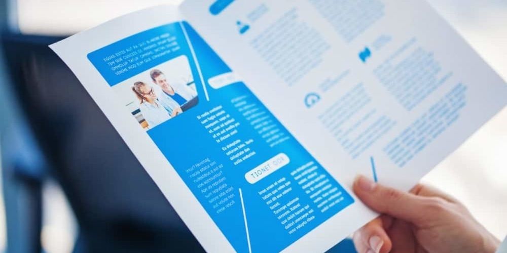
Whilst we are all spending so much time on the internet, ‘online’ looks like the ‘be all and end all’ of marketing. But don’t make the mistake of disregarding the more traditional forms of direct marketing such as a company brochure, they are a useful and tangible information tool which can set you apart from your competition and help you to gain more customers, if done well.

DON’T TRY TO BE EVERYTHING TO ALL

Most companies can identify more than one type of customer that they serve and are targeting. Perhaps your clients are commercial as well as domestic or in the private sector and the public or your customers have different areas of specialism such as IT executives versus HR consultants. I bet you can identify different segments with very different requirements and solutions that you offer. So why try to create one brochure that provides information on all your services that speaks to everyone and therefore no-one at all. Create separate brochures that target each customer type, some pages may be the same within the brochure and you could opt for a folder style brochure with individual factsheets.

GIVE YOUR BROCHURE A HUMAN VOICE

Write your brochure in ‘first person’ so that you are talking TO the customer rather than at them. Of course, we can help you with this but if you would rather write it yourself, when writing it, be sure to say ‘we can do this for you’ rather than ‘the company can do this for you’. Use an ‘active’ voice rather than a ‘passive’ voice so instead of saying ‘when working with clients, we maintain a high standard’ use ‘ we maintain a very high standard when working with clients’.

Read more

Hot tips: Designing the perfect brochure

Hot tips Designing the perfect brochure

The paperless society never arrived. Printed brochures remain popular for their touchy-feel appeal, so get back with your PDFs! And while fewer companies mass print and distribute, brochures are still widely used within both B2B and B2C hemispheres for all kinds of products and services.

Keeping in mind the costs of layout, production, printing and postage, it’s important to get brochure design right first time. So what are the secrets of success?

Design.

Start by thinking about size and aspects. Common, economical sizes which are typically used for brochure printing are B5 (240 x 170mm) A5 (210 x 148mm) or A4 (297 x 210mm). Do you want portrait or landscape? This might depend on your images, especially the size and quality, but it’s very much a personal preference. The widescreen look, A4 landscape, is a popular modern style. Calico can advise you on what’s best for your products.

Colour.

Most brochures are printed in 4 colours throughout, although sometimes a fifth colour, typically a Pantone (PMS), might be specified for a specific element, like a logo, to ensure colour consistency throughout. Calico has many clients who use metallic inks such as gold or silver for beautiful effects, especially on covers.

Graphic design and layout.

More than just colours and graphics, layout entails an understanding of usability, organisation and aesthetics. Overall, it drives how somebody might interact with the brochure. The cover and contents page must work together to deliver an anticipation of what lies within. All brochures should have a table of contents, and larger ones may utilise folios or tabs. Calico can advise on design and layout aspects of brochures. Don’t forget, white space is good!

Read more

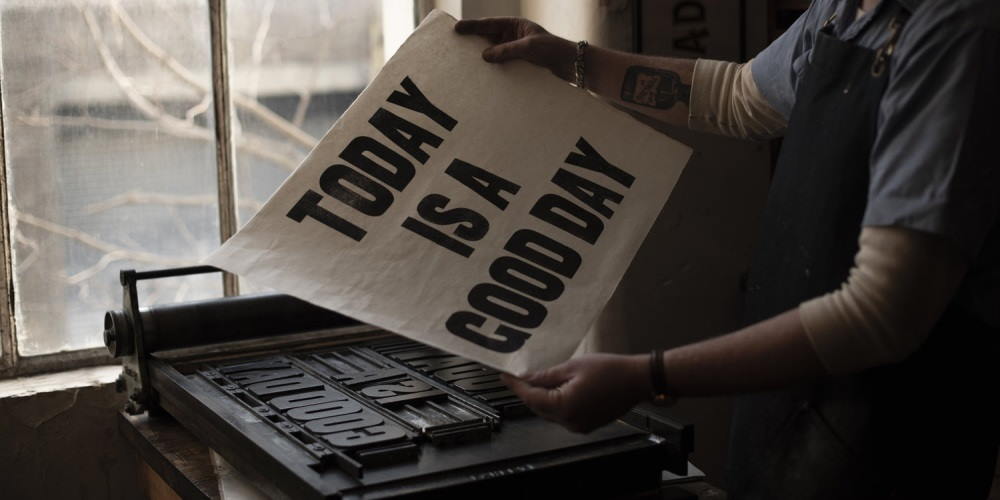
Roll over internet. Social sharing started with Letterpress!

Roll over internet. Social sharing started with Letterpress!

WHAT IS LETTERPRESS PRINTING?

Letterpress printing is a ‘relief’ form of printing, meaning ink is applied to the raised areas of a printing plate or block and ‘pressed’ on to a piece of paper or other material. This form of printing initially originated in China and the Far East, however in the western world it came to prominence in the 1400s. For over 500 years it was the primary form of printing from books to simple pamphlets. Even though it is not used at the industrial scale it used to be, it is still being used today for more artisanal applications.

Johann Gutenberg & movable type

The 15th century saw a massive revolution in the printing throughout Europe and the Western world. Johann Gutenburg invented the printing press and introduced Europe to moveable type.

In the decades just preceding the 15th century, printing of any kind required craftsmen to carve entire pages of text into wooden blocks. Once the text was carved, the space around the letters had to be whittled away so the text was the only surface that would touch the page. The blocks would then be inked and paper placed on top, and rubbing the paper onto the wood would create an impression. As you can image this means each page of a book would have to be carved out individually, a time consuming process meaning copying a book fully would take a massive amount of time and skill. Gutenburg revolutionised this process by developing individual reusable letters carved into wood blocks. These wooden blocks could then be arranged, rearranged and reused to form full words over and over again. Gutenburg then developed this theory to use metal type to improve the final quality and clarity of print. This metal type included lower case, upper case and punctuation marks.

The printing press Gutenburg developed, the ‘Gutenburg Press’ or screw press was used to transfer ink, which he also developed by him, to the paper. His press printed approximately six pages of a book per day. The most famous of these books was the Bible or ‘the Gutenburg Bible’ – 180 copies of this were produced.

Read more

Exhibition checklist: A handy printable guide

Exhibition checklist A handy printable guide

Exhibiting at a show is a great opportunity to demonstrate your product or service face-to-face with potential buyers, make new contacts, acquire new sales leads and test a new market.

Like anything, an exhibition works best when it’s carefully planned well in advance. It’s advisable to set clear measurable goals and create a task list that includes the post exhibition follow up and sales process.

We regularly help design exhibition materials including pop-up stands, pop-up banners, and a variety of exhibition give-aways. To help clients we’ve produced a handy exhibition checklist to print off and assist you when planning your next show.

Among the things to remember are:

Exhibition goals

Set yourself clear goals, for example, it could be to gain 50 new sales leads, book follow up product demonstrations or to conduct valuable market research with potential buyers into a new market.

Project management

Appoint someone to coordinate the stand and arrange staffing, travel and accommodation, as well as acting as stand manager on the day.

Read more