Events and things of interest in the local area!

Events and things of interest in the local area!

As I’m sure you well know, Mid Sussex is a vibrant area with loads to do and many different events and services on offer.

Lots of services and things to do in Hurstpierpoint, Haywards Heath, Hassocks, Ditchling, Brighton etc. are all on offer, here are a few things we think you should know about

Calico love being involved with local businesses and museums, especially Ditching Museum who are brilliant to work with.

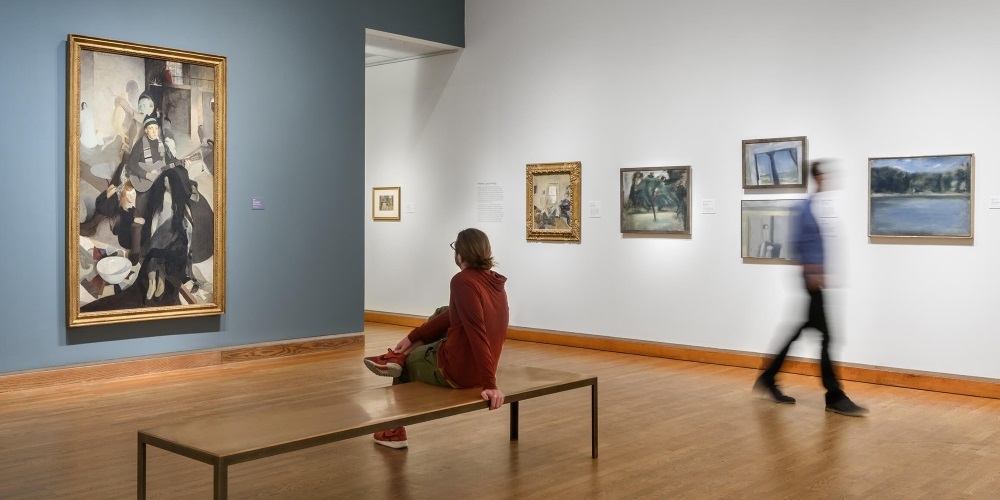
Ditchling museum is running many events in the up and coming year. One of these events is The INTEROBANG Exhibition, a letterpress exhibition, which is curated by Ditchling Museum for The Village of Type. It’s an open submission event – visit their website for details – get your letterpress printing professionally exhibited!

Why not get down to one of The Village of Type’s activities, exhibitions or workshops celebrating 100 years of Edward Johnston’s typeface he designed for the London Underground – a Calico favourite.

See their website for details – it going to be fantastic.

Just down the road from Ditchling Museum is Pruden and Smith, a gold and silver smith and jewellers, founded in 1988.

Read more

5 Sure-Fire tactics to improve your website conversions

5 Sure-Fire tactics to improve your website conversions

Unless you’re a Marketer, you may not have heard of Conversion Rate Optimisation (CRO), but it’s actually a critical part of a successful marketing strategy and essential to maximise your opportunities for acquiring new customers.

In this article, we’ll start by explaining CRO and what it entails and as well as sharing with you our very best top 5 tips to improve your website conversions, which is essentially concerned with getting your website visitors to perform an action you want them to take, whether it’s signing up for a free trial, subscribing to a email newsletter or purchasing your wares. Of course, the ultimate goal is to convert website visitors into paying customers, so it’s pretty key stuff.

WHAT IS CONVERSION RATE OPTIMISATION (CRO)?

CRO is a structured and organised approach to improving the performance of your website and making the most of the traffic you already have on your website. It’s informed by insights, rather than hunches and it’s defined by your website’s objectives and KPI’s.

WHAT CONVERSION RATES ARE WE LOOKING TO IMPROVE?

Your Total Conversions is number of people who performed the desired action (email newsletter, made a purchase etc).

Conversion Rate – divide the above total number of conversions by the number of visitors to your site.
For example, a site with 1000 visitors and 10 conversions has a conversion rate of 1%.

WHY IS CRO IMPORTANT?

You may be doing rather well in getting new visitors to your website, whether through SEO, PPC or social media, or if you’re integrating your campaigns, a combination of all three. All this involved an investment in time and money and with paid advertising getting more costly and competitive, spending more is not always the answer to getting more enquiries. There may be problems in your conversion funnel and things can be tweaked and improved to get more enquires for the same or even less spend.

Read more

Greek is making the headlines, literally.

Greek is making the headlines, literally.

LITHOGRAPHIC VOLUME PRINTING

Lithography is ancient Greek text by definition, with Lithos translating as “stone” and graphein to “write.” Therefore to write in stone, to set in stone is to be lithographic.

This method of printing began in 1796, when the Bavarian author and actor Alois Senefelder realised that water would not dissolve oil, that they remained separate entities and repulsed each other, that they were immiscible.

Back in the nineteenth century, an image would be drawn in reverse with fat, oil or wax onto a smooth limestone plate. When acid was applied to the stone, those areas not protected by the fat, oil or grease became etched. When the stone became wet, the etched areas retained the water, whilst the rest of the plate retained oil-based inks, due to the immiscibility of the two liquids. The inked plate would then be transferred onto a blank sheet of paper and the reversed etched image, would appear printed in all it’s obverse glory as originally intended.

In 1837 the Frenchman Godefroy Engelman devised chromolithography, whereby separate plates were used for each colour – (C)yan, (M)agenta, (Y)ellow and blac(K) – CMYK. The challenge that developed was to keep everything in line, or “in register” so that the final printed image made clear sense.

At the end of the nineteenth century a modification to the process was created by transferring the image from the plate to the paper, via a rubber plate. This is offset lithographic printing. It gives the printer several advantages: The plate never comes into direct contact with the paper, so it has a longer lifespan. The ink can be controlled more effectively and the image is constant, clean, crisp and sharp.

Read more

Get some brand power! Big brand secrets.

Get some brand power! Big brand secrets.

Taking on established companies is a huge challenge for new business. How do you become known?

Branding is more than logos

Your brand goes deeper than a logo. Branding is a set of associations held in mind by a potential customer. The culmination of lots of factors – design, advertising, displays, marketing and how you treat customers – will generate associations. Studies suggest that as much as 75% of purchase decisions are based on emotion. Branding can make your business perform better by harnessing these associations and emotions – that’s brand power!

Secret No. 1: Be clear about what your business stands for.

Formulate a concise message with resonance, e.g. ‘Every Little Helps’, and project this across your marketing. Head out of the sand

Products and services don’t sell themselves. You may have to spend as much as 20% of turnover during the early brand-building years. Ignoring marketing until it’s too late leads to panic spending. There’s nothing like a badly-managed Adwords campaign for wasting money! Be consistent, and work towards a set of goals.

Read more

A to Z of website features and design

A to Z of website features and design

DO YOU KNOW YOUR MEGA MENUS FROM YOUR RSS?

Ice creams come in many flavours, so it’s worth checking out the latest – corn-on-the corn with black pepper? Web design is very similar. Before you decide what you want, you need to know what’s available. You may have seen features on other company’s sites that you like, and you want to emulate those, but there’s a whole universe of options. Do you know your mega menus, GoogleBots and Splashscreens from your RSs?

A TO Z OF WEBSITE FEATURE AND DESIGN

Take a look through this table of features and think how some of these might benefit your business or organisation. Many of these will help to put a message out in a more efficient way, so it’s well worth thinking through your options before committing. Ask your experienced web design company, like Calico, for their opinion on how some of these can benefit your business.

Accept cookies pop-out

Most websites operate with tracking data, such as Google Analytics, which offers valuable insight into how many visitors come to your site, what keywords they use to find you and what content they look at, etc. These applications deploy cookies in order to provide you with this information. Cookies are very small text files which are stored on your PC, laptop, mobile phone or tablet when you visit a website. All websites owned in the EU or targeted towards EU citizens, are now expected to comply with EU Directive and inform consumers about how information about them is collected by websites. That’s why we have the Accept Cookies pop-up.

Aggregator

Small websites can provide a large, wide-ranging number of stories by aggregating news from other media institutions or social media sources. Aggregation can also pull in a diversity of voices into a single site. Use this to get your site notice by a diverse range of visitors.

Blog/News post

Blogs are like news, except typically more informal. They often allow users to navigate posts by date, category and tags, and showcase blog authors with thumbnails. They invite feedback via comment forms – these can be pre- or post-moderated. Whether you have a special interest or want to publish content for search engine ranking purposes, each website we build comes with blog capabilities.

Read more

Why SMEa’s Need to Become the Brand

Why SMEa’s Need to Become the Brand

No matter the size of your business, clear and original branding paves the way to success. But it seems small businesses in the UK are not cutting the mustard when it comes to brand identity and that SMEs may need a helping hand to deliver a memorable brand experience.

Vistaprint’s Small Business Uniqueness Report reveals, as well as being unable to define their brand, everything from language to font to colour are copycat stumbling blocks for small business. Here are the key findings:

• 77% use more than one typeface in website copy and 51% use a minimum of three
• 74% repeat the same adjectives in website copy
• 46% choose blue for their branding, 21% choose grey and 18% choose red

Head of UK Marketing at Vistaprint, Jake Amos, commented: “There are so many brilliant creative and individual small businesses in the UK, however, there is a disconnect in how many of them communicate that individuality to the world. It can be overwhelming for small business owners when first starting out and knowing the best way to brand and market their business is an important step in their journey towards success. We created this report as we want to support small businesses in uncovering their unique qualities to help them better stand out from the crowd and achieve their vision”.

Calico’s branding mantra
Here are five reasons it’s important for you, as an SME, to “become” your brand:

Brand identity
Your brand should have its own unique identity, the more you immerse yourself in the brand the more you can understand it and communicate your brand message effectively to your customers. In the same way you should know yourself before embarking on a romantic relationship if you want it to succeed, you should be able to define your brand and your USP.

Read more

Millions Images for Your Website Only at Depositphotos

Millions Images for Your Website Only at Depositphotos

There are a lot of images available on the internet. Some are free and the others are available at certain prices. Getting free images are a good but not great choice for website, especially the professional one. For this case, it is better to find out images in microstock website where quality images are available in low prices and with free royalty.

From many microstock websites on the internet, Depositphotos, is one great choice. This website is reputed as the fastest-growing microstock agency because of its well and fast development. Depositphotos provides more than 15 million stock images which are varied in form of photo and vector or illustration. Besides that, this website also provides stock footage. It is also trusted by more than 1 million users from all over the world, showing that they are quite professional in this kind of business.

For browsing all those images and finding the one that you needed, user can use search function. Besides that, you can also use the prepared categories which specifically contains certain images based on their theme or related attributes. However, generally you will find two types of images in this site: stock photography and stock vector.

Stock Photography

Photographs which are available in Depositphotos are varied and have large number of collection. The quality and art of photographs displayed on Depositphotos does not need to be doubted as they are taken by great photographers. Besides that, every photographs uploaded had been selected carefully to ensure its quality before it is sold. Photos are very good to be included in website’s banner or article.

Read more

Timeline Content Banner – So simple yet so powerful

Timeline Content Banner - So simple yet so powerful

Content Timeline – jQuery/HTML5/CSS3 Plug-in is a plug-in that can display the unlimited number of elements that along with the preview element also have the “Read more” element that you can customize as you wish.

Content Timeline

I played around with it, gave it a go with some of my content and it worked perfectly in most cases. It is fairly easy to customize and to set dates along the timeline. Design can be changed by simply replacing the images that represent the buttons and the timeline. Colors, backgrounds and majority of other variables are all driven by CSS3 and can be altered easily. The jQuery script works well while many other scripts are activated on the same page.

Content Timeline

As I like the concept very much i would love to get the option to arrange my services along the timeline or to set a project timeline with detailed description of the work that has been done each day. Unfortunately this is not included, yet.

Read more

Create an effective company brochure

Create an effective company brochure

Whilst we are all spending so much time on the internet, ‘online’ looks like the ‘be all and end all’ of marketing. But don’t make the mistake of disregarding the more traditional forms of direct marketing such as a company brochure, they are a useful and tangible information tool which can set you apart from your competition and help you to gain more customers, if done well.

DON’T TRY TO BE EVERYTHING TO ALL

Most companies can identify more than one type of customer that they serve and are targeting. Perhaps your clients are commercial as well as domestic or in the private sector and the public or your customers have different areas of specialism such as IT executives versus HR consultants. I bet you can identify different segments with very different requirements and solutions that you offer. So why try to create one brochure that provides information on all your services that speaks to everyone and therefore no-one at all. Create separate brochures that target each customer type, some pages may be the same within the brochure and you could opt for a folder style brochure with individual factsheets.

GIVE YOUR BROCHURE A HUMAN VOICE

Write your brochure in ‘first person’ so that you are talking TO the customer rather than at them. Of course, we can help you with this but if you would rather write it yourself, when writing it, be sure to say ‘we can do this for you’ rather than ‘the company can do this for you’. Use an ‘active’ voice rather than a ‘passive’ voice so instead of saying ‘when working with clients, we maintain a high standard’ use ‘ we maintain a very high standard when working with clients’.

Read more