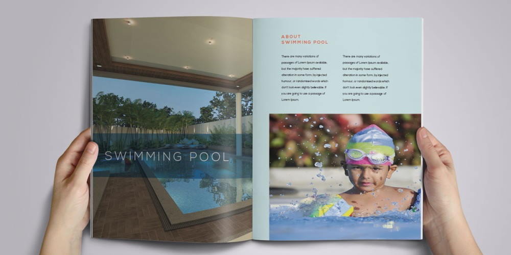
The paperless society never arrived. Printed brochures remain popular for their touchy-feel appeal, so get back with your PDFs! And while fewer companies mass print and distribute, brochures are still widely used within both B2B and B2C hemispheres for all kinds of products and services.
Keeping in mind the costs of layout, production, printing and postage, it’s important to get brochure design right first time. So what are the secrets of success?
Design.
Start by thinking about size and aspects. Common, economical sizes which are typically used for brochure printing are B5 (240 x 170mm) A5 (210 x 148mm) or A4 (297 x 210mm). Do you want portrait or landscape? This might depend on your images, especially the size and quality, but it’s very much a personal preference. The widescreen look, A4 landscape, is a popular modern style. Calico can advise you on what’s best for your products.
Colour.
Most brochures are printed in 4 colours throughout, although sometimes a fifth colour, typically a Pantone (PMS), might be specified for a specific element, like a logo, to ensure colour consistency throughout. Calico has many clients who use metallic inks such as gold or silver for beautiful effects, especially on covers.
Graphic design and layout.
More than just colours and graphics, layout entails an understanding of usability, organisation and aesthetics. Overall, it drives how somebody might interact with the brochure. The cover and contents page must work together to deliver an anticipation of what lies within. All brochures should have a table of contents, and larger ones may utilise folios or tabs. Calico can advise on design and layout aspects of brochures. Don’t forget, white space is good!
Imagery.
The best brochures are highly visual, allowing the user to quickly scan through content. A word of caution: don’t mix styles too often. It’s good to set the scene with mood images, with interplay between people, products and environments, but when it comes to product photography, make sure you create some standards for all the images. A white background is easier on the eye and allows the products to shine.
Text.
Brochure copy should follow a house style, so it remains coherent and dependable. Defining the house style is one the earliest decisions to make. Will it be quirky, amusing or educational, or concise and literal. All of these have a place, but it largely depends upon the look and feel of your brand.
Actions.
Make it easy for consumer to interact with your brochure. Refer to online promotions to drive traffic to your site. Clearly communicate when there are multiple options for ordering. Highlight ordering options on every page or spread.
Printing and finishing.
It’s essential to thoroughly consider printing and finishing before you start design. Obviously the quality of paper, covers, binding and types of finishes can make a dramatic difference to the overall unit price, as well as the postage costs.
Paper quality.
Typical brochures utilise a 300/350gsm gloss, silk, matt or uncoated paper for the covers. Inside, the pages are typically printed on 100/130/150gsm silk, matt or uncoated papers.
Cover finishes.
Matt or gloss laminated are popular. Textures and glosses to highlight certain features are possible. Common finishes include spot u/v, u/v varnished extra glossy finish, gold, silver or bronze foil blocking. These add a super luxury feel that will definitely make a bid impression on your customers.
Binding.
Brochure binding options depend largely on pagination – the number of pages – and the weight. A perfect bound brochure, for instance, provides a flat spine for printing a logo and title, but it usually necessitates at least 70+ pages. Popular binding types include saddle stitched, perfect bound, PUR bound, wiro bound, ring binders, loose leaf binders, paper overboard binders.
Finally, you have to think about the print run volume.

